AI-designed blogs with 100-point results
Three AI-designed blogs, strong homepage PageSpeed results, and 100/100 Lighthouse Accessibility scores across every tested page. See how distinctive design can come with a strong foundation for readers with disabilities.
A fashion journal with room for its photography. A personal blog with bold type and a compact reading list. A product publication with warm colors and editorial headlines.
GoodSender's AI design tools can help you make a blog that feels like yours. The quality of the finished page matters just as much as the freedom to shape it.
So we checked three live GoodSender blogs with Google PageSpeed Insights. All three homepages reached 100 for desktop performance. Mobile homepage scores ranged from 96 to 100 across the tests. And one customer article achieved 100 in all four main categories, on both mobile and desktop.
Every tested homepage and article also scored 100/100 for Accessibility on mobile and desktop—a result worth highlighting for publishers who want to reach readers with disabilities.
Here are the blogs behind those numbers.
Your style, on your domain
Lemann Fashion Journal leads with a large fashion photograph, generous white space, and restrained black typography. The design gives the clothes and bags room to be seen, with stories and collection links below.

Lemann Fashion Journal: a visual, spacious design for a fashion brand.
Author's blog takes another direction: a dark header, condensed uppercase headlines, and a compact list of essays about building software with AI. Dates, reading times, and small thumbnails make it easy to scan.
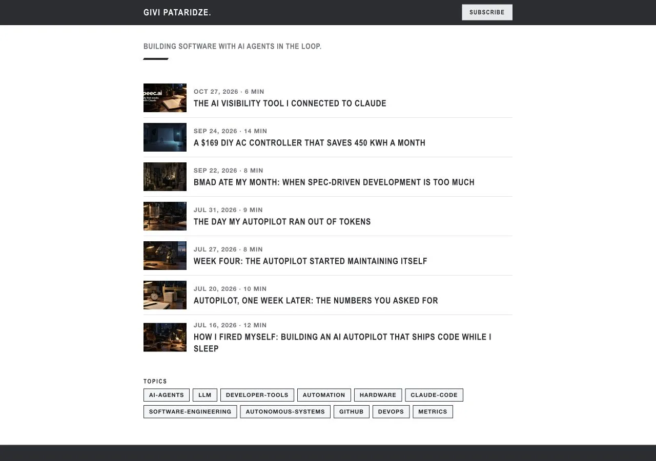
Author's blog: a compact personal publication with a different visual identity.
The GoodSender Blog uses a warm cream background, serif headlines, and illustrated post cards. It looks like a publication about the product it belongs to.
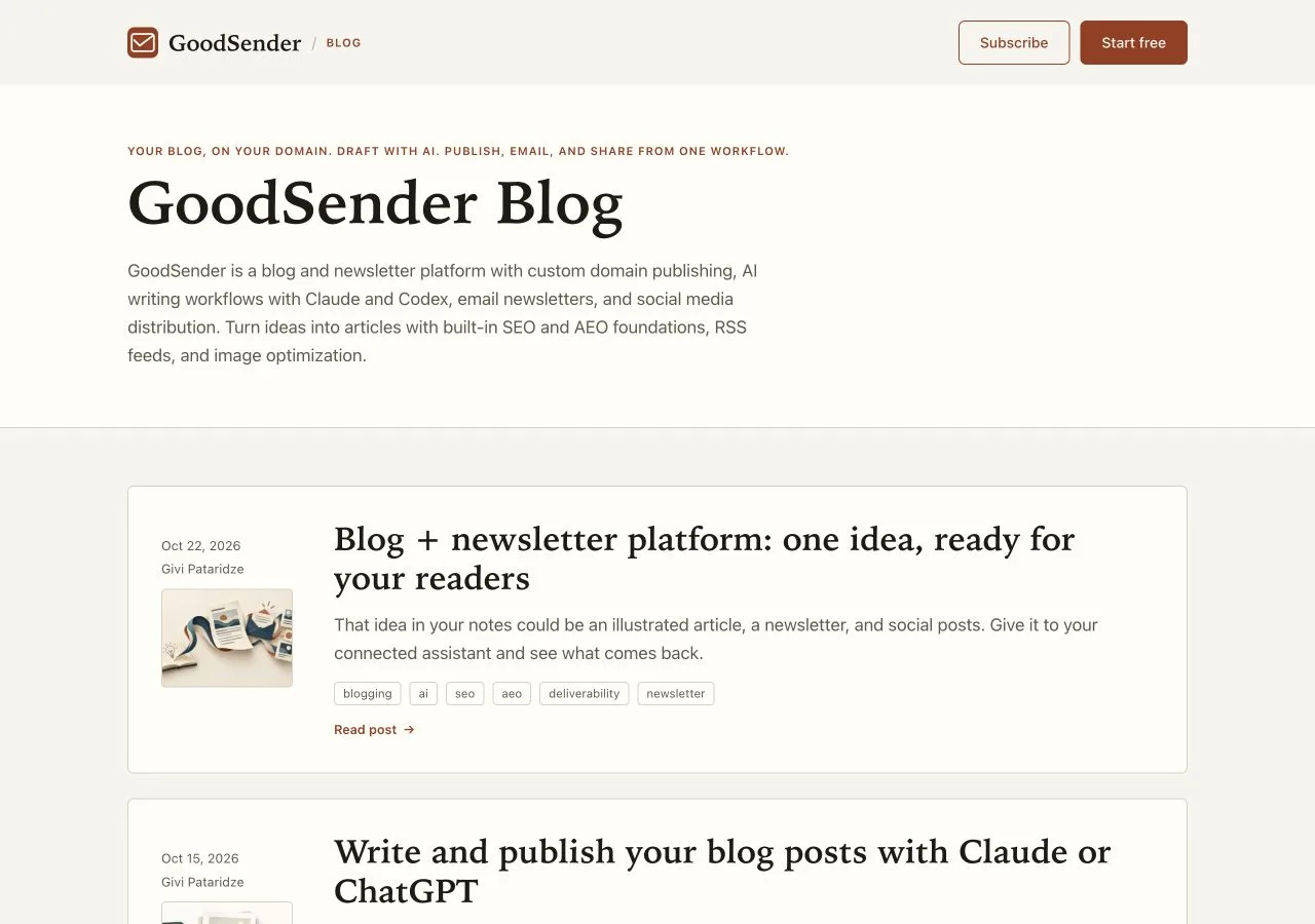
GoodSender Blog: warm colors and editorial typography.
These three blogs were created with GoodSender's AI design tools. They share a publishing platform while giving their brands different visual identities.
We made no special, site-specific adjustments to improve these benchmark results. We tested the live blogs with their own designs and published content.
That is the appeal of designing your blog in conversation: describe the look you want, bring your brand references, and refine the result. The design can cover your homepage, archive, tag pages, and articles together.
The homepage scorecard
We requested two PageSpeed analyses for each homepage on October 29, 2026, recording mobile and desktop results. These ranges include both results:
| Blog | Mobile performance | Desktop performance |
|---|---|---|
| GoodSender Blog | 96–98 | 99–100 |
| Lemann Fashion Journal | 98–99 | 100 |
| Author's blog | 98–100 | 98–100 |
Every homepage report also scored 100 for Accessibility, 100 for Best Practices, and 100 for SEO.
The different designs matter here. The sample includes a fashion storefront's journal, a personal publication, and a software company's blog. Each reached the top desktop performance score with its own live layout and content.
Four 100s on a customer article
A Lemann Fashion blog post is a published product story with photography and details about the bag.
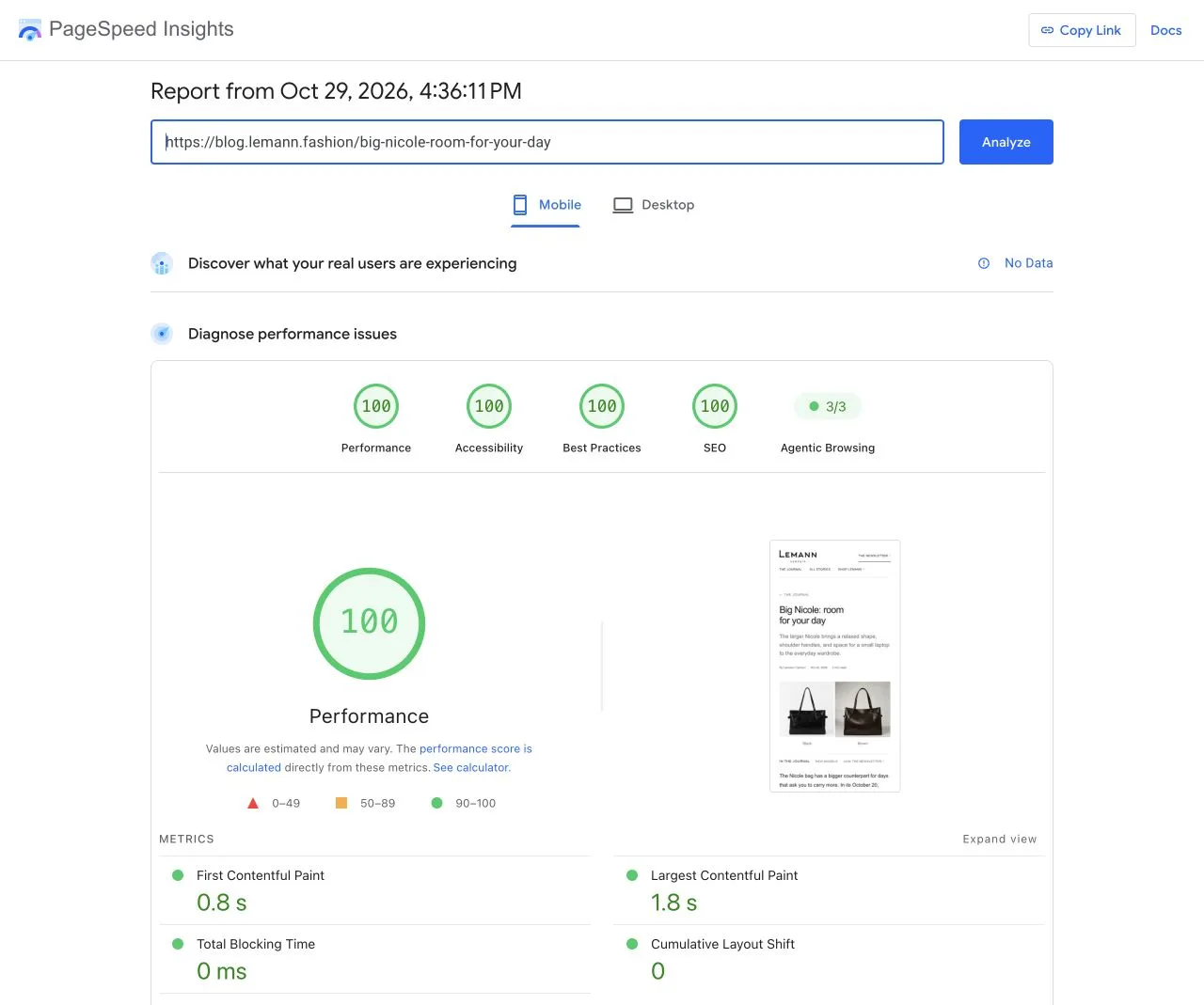
Its first PageSpeed report returned:
| Category | Mobile | Desktop |
|---|---|---|
| Performance | 100 | 100 |
| Accessibility | 100 | 100 |
| Best Practices | 100 | 100 |
| SEO | 100 | 100 |
Lemann Fashion blog post: 100 in all four main categories in this mobile report, October 29, 2026. Its desktop result in the same report also scored four 100s.
In that mobile test, its Largest Contentful Paint was 1.8 seconds, with zero measured layout shift. The second report scored 99 for mobile performance and 100 on desktop; the other three categories stayed at 100.
That is a concrete example of the result a GoodSender customer can achieve with an AI-designed blog.
We also tested the first listed article on each of the other two homepages. Across both report requests, the article performance scores were:
| Article | Mobile | Desktop |
|---|---|---|
| GoodSender: Blog + newsletter platform | 85–86 | 98–99 |
| Lemann Fashion blog post | 99–100 | 100 |
| Author's blog: The AI visibility tool I connected to Claude | 63–75 | 95–96 |
Accessibility, Best Practices, and SEO remained 100 in every article report. The performance differences are a reason to test your actual posts as well as your homepage: a 100-point result belongs to the page and test that achieved it.
Another view of loading speed
We ran one WebPageTest on each of the same six URLs, selecting US, Mobile, and Regular4G. The reports identified an iPhone 15 device profile, Chrome 152, and a 4G connection at 9 Mbps with 170 ms round-trip latency. The service assigned test locations in Columbus, Council Bluffs, and Los Angeles.
| Page | Largest Contentful Paint | Total Blocking Time | Layout shift (CLS) |
|---|---|---|---|
| GoodSender homepage | 1.41 s | 1 ms | 0 |
| GoodSender article | 1.48 s | 60 ms | 0 |
| Lemann homepage | 2.99 s | 0 ms | 0 |
| Lemann Fashion blog post | 2.63 s | 0 ms | 0 |
| Author's blog homepage | 1.14 s | 63 ms | 0 |
| Author's blog article | 2.56 s | 168 ms | 0.199 |
Five pages recorded zero layout shift in these runs. The Author's blog article recorded 0.199, and WebPageTest also flagged one accessibility issue rated serious for review.
Read these as a separate set of lab measurements: the device profile and network settings differ from the PageSpeed runs. The useful evidence is how each real page performed under the stated conditions.
100/100 Accessibility scores: a foundation for more readers
Every one of the six pages in our PageSpeed tests scored 100/100 for Accessibility in both device modes, across both report requests. That makes accessibility one of the strongest results in this comparison.
Lighthouse's automated accessibility checks cover issues such as text contrast, image alt attributes, accessible names for links and buttons, and page structure. These details serve people: sufficient contrast helps readers with low vision, while well-structured content and text alternatives help screen-reader users navigate and understand a page.
For publishers, that is a major benefit of these results: distinctive AI-designed blogs with a strong accessibility foundation for readers with disabilities. A 100/100 score reflects the automated checks included in the score; manual keyboard and screen-reader testing still matters.
WAVE: 9.5–10 out of 10
We also checked the same six pages with WAVE. Their Automated AIM scores ranged from 9.5 to 10 out of 10. WAVE reports errors, contrast errors, and alerts separately:
| Page | AIM / 10 | Errors | Contrast errors | Alerts |
|---|---|---|---|---|
| GoodSender homepage | 10 | 0 | 1 | 0 |
| GoodSender article | 9.7 | 0 | 1 | 0 |
| Lemann homepage | 9.5 | 0 | 0 | 34 |
| Lemann Fashion blog post | 9.9 | 0 | 0 | 4 |
| Author's blog homepage | 9.5 | 1 | 0 | 10 |
| Author's blog article | 9.5 | 1 | 0 | 7 |
Both tested Lemann pages had no detected errors or contrast errors. WAVE flagged one contrast issue on each GoodSender page and one missing form label on each tested Author's blog page. Its alerts also called attention to details such as redundant links and small text.
Those findings belong beside the high scores. WAVE's automated rating is one measure of accessibility; its detailed findings still need review, and a high score does not establish full accessibility or conformance.
Quality beyond the performance circle
Google's Rich Results Test found one valid Article item and one valid Breadcrumb item on each of the three tested articles. Lemann's Article item had an optional author-URL warning and remained valid.
The homepage reports also recorded zero layout shift in every test. At a 390-pixel browser width, all three homepages fit without horizontal page overflow.
These checks complement the design. GoodSender's publishing system supplies page metadata, canonical addresses, and structured data around the custom layout. Its RSS feed and sitemap are generated separately from the design, so the visual direction is not the whole publishing setup.
Give your blog its own identity
Bring the mood, typography, colors, or brand references you have in mind. Use GoodSender's designer to shape the publication, preview the pages, and refine the details.
The examples above show what that can produce: distinctive blogs on their own domains, with real pages reaching the highest PageSpeed scores.
Explore Lemann's journal, Author's blog, and the GoodSender Blog. Then create a blog that looks like you.
About the tests: the PageSpeed comparison covers six URLs and two PageSpeed report requests per URL, with both device modes recorded, on October 29, 2026. WebPageTest and WAVE each checked the same six URLs once that day; WAVE used its online evaluation tool. PageSpeed mobile tests used an emulated Moto G Power, slow 4G throttling, and Lighthouse 13.5.0. Scores can vary by page, content, and run. PageSpeed reported no real-user data; these are lab results, not a field Core Web Vitals pass or a guarantee for every blog. Automated accessibility and SEO scores do not establish full accessibility conformance or search rankings.